

How I'm Building a Substack Analytics Dashboard With No-code AI
Using Cursor to create a tool that makes Substack analytics actually useful.


🎯 Why I Wanted a Better Dashboard
Substack provides only basic metrics, such as subscribers and views. While this offers a quick snapshot, it is insufficient for understanding what truly drives engagement. For instance, it lacks insights into how engagement evolves over time, which post lengths perform best, or which topics consistently attract readers, among other metrics.
After a few months of publishing, I realized I needed something deeper. Something that could track all my posts, highlight top performers, and uncover those hidden signals like posting frequency, engagement rate, click-through-rates (CTR) or even average reading time.
That’s how this little experiment started. I wanted a simple dashboard that showed the full picture without needing a background in data science. We can all access some of the basic KPIs like subscriber counts, open rate, and views. I have been curious to go a step further by building a robust dashboard that incorporates the ‘invisible’ KPIs I have mentioned earlier.
To achieve this, I tested an analytical tool that I built using Cursor, a code editor designed for AI-assisted programming. Although it still a work in progress and embodies mostly the same functionality as a Substack dashboard, it helps organize performance analytics much better and, as you will see later, helps any creator to compare top performing posts with others in a clean spreadsheet view. In the coming weeks, I will be running several tests on the backend stack. I will also add more useful, user KPIs after receiving inputs from the wonderful community of creators in Substack. So, if you feel that Substack dashboard is missing few parameters that are important data points in analysis of your channel, reach out to me!
🤖 Why I Used Cursor
Cursor felt like a coding buddy that actually listened. I could type what I wanted in plain English and it wrote code, explained what was happening, and even remembered the project context (largely!).
I have worked with other tools like Lovable and Supabase previously where I built a web prototype of an existing WhatApp group for finding rental accomodations. After feeling more confident in dealing with codes (and bugs), I shifted my attention to the popular AI coding tool, Cursor. Instead of just spitting out snippets, it walked me through debugging, formatting, and even front-end tweaks.
If you’re a non-technical creator curious about coding and building, Lovable is a great starting point while Cursor helps you play about a bit more with your scripts since it:
Understands your whole project, not just code snippets.
Cursor reads all your files, remembers context, and edits intelligently across them - all while seeking your approval.Debugs and refactors like a real teammate.
You can ask why something broke, and it will explain, fix, and clean up your code conversationally. I also used it to clean up the cache of files that were not needed.Lets you build in plain English.
Describe what you want and Cursor writes, tests, and organizes the code so you can focus on ideas, not syntax.

After a few minutes of tinkering in Cursor, I decided to give it a real test. I started generating my code through iterative prompting and understanding the workflow at every step.
Phase 1: Getting the Data
I started with the RSS feed. Every Substack includes one, and it is structured in XML, a format that is easy to parse and generally contains comprehensive information.
Here’s a shortened version of a prompt I gave Cursor:
I want to write a Python script to create a data analysis dashboard for any publication on Substack. It should go through a publication’s RSS feed and provide basic performance metrics to analyze. For this purpose:
- Provide me an input command to drop in the publication's URL
- Browse through RSS feeds and analyze All posts from the Substack publication
- Print the title, publication date, and word count for each post.
I will use my own publication's URL to start the tests.
RSS turned out to be the perfect backbone. It is structured, stable, and complete. It gives me the full post history, works well for programmatic access, and avoids a lot of the pain that comes with searching dynamic pages. This let me pull every post, not just the recent ones, which matters when you want true averages and trends.
Phase 2: The Emoji Meltdown
I realized that the emojis in our posts was not well understood by the machine. Once fetching worked, emojis broke everything. The script crashed the moment it hit one.
Hence, I prompted:
My script crashes with UnicodeEncodeError whenever a post has emojis or special characters. It is not being ingested well by the code. Can you fix it so it handles UTF-8 encoding properly and doesn’t break?
Cursor added UTF-8 encoding, safer text-handling, and fallbacks. The script ran through without issues after some recursive prompting. Lesson learned: the internet’s messy, and you should handle it gracefully.
Phase 3: Using Extracted Data for Engagement metrics
RSS feeds are structured, but they don’t include engagement metrics like likes, comments, shares, open rates, views and subscriber counts.
For this I prompted:
Using BeautifulSoup, add a functionality in Python code that can use the data scripts to:
- Extract engagement metrics (likes, comments, shares, restacks, word counts, etc) for all the posts in the publication
- Calculate comprehensive statistics to rank top performing posts
I was able to get the following insights from Cursor on my articles:
| Field Name |
|------------|
| Rank |
| Title |
| Total Engagement |
| Likes |
| Comments |
| Shares |
| Restacks |
| Word Count |
| Reading Time (min) |
| Published Date |
After this step, the tool started feeling like an actual analytics platform. (⚠️ The subscribers’ count functionality needs more work because the code is facing issues with processing Substack’s HTML for the same)
Phase 4: Adding Guardrails for Accuracy
The results produced by my initial algorithms included several factual inaccuracies. Some data points seemed to be made up by the code. I wanted this tool to be accurate and verifiable and it was important to communicate this to the AI.
The output is showing some inaccurate numbers in some performance metrics. Add validation so the data looks accurate and factually correct.
- Cross-check with RSS data and fix the bugs in data extraction
- Remove suspicious and inaccurate figures and put '-' for categories you cannot extract data points
After adding checks and caps, everything looked right, barring the shares and restack counts on some occasions. This needs more work as I build the tool.
Phase 5: Export Everything to Excel
I like exporting data into an excel spreadsheet for easy readability and to catch a break from coding! Besides, every creator, regardless of technical experience, can use it to play around with numbers. So I asked Cursor:
I want to create an Excel spreadsheet to display all the findings. For this, generate a timestamped Excel file with complete data. Create the following tabs in the Excel file that you generate after I run the code:
- Overview showing summary stats
- Analytics Summary showing averages
- All Posts showing every data point
- Top Posts, ranked in a list
Finally, after some scripts runs, the code ingested an output that gave me first win in data extraction. I could see all engagement metrics (barring some) for each post, the averages and the top performing posts ranked with each metrics assigned to it for comparison.
Phase 6: Turning Data Into A Web Dashboard
Raw data is fine, but I wanted something I could open in a browser as well. So I used Flask and Bootstrap to build a simple dashboard.
The prompt I gave Cursor:
Create a Flask web app that shows Substack analytics from my code. Use Bootstrap for styling. Display:
- Subscriber count
- Post performance
- Top content
-Publishing frequency
- Engagement rates
A few tweaks later, I had a clean, responsive dashboard that loaded instantly. It wasn’t fancy but it was readable and actually fun to use.
I have attached a video below sharing how it works:
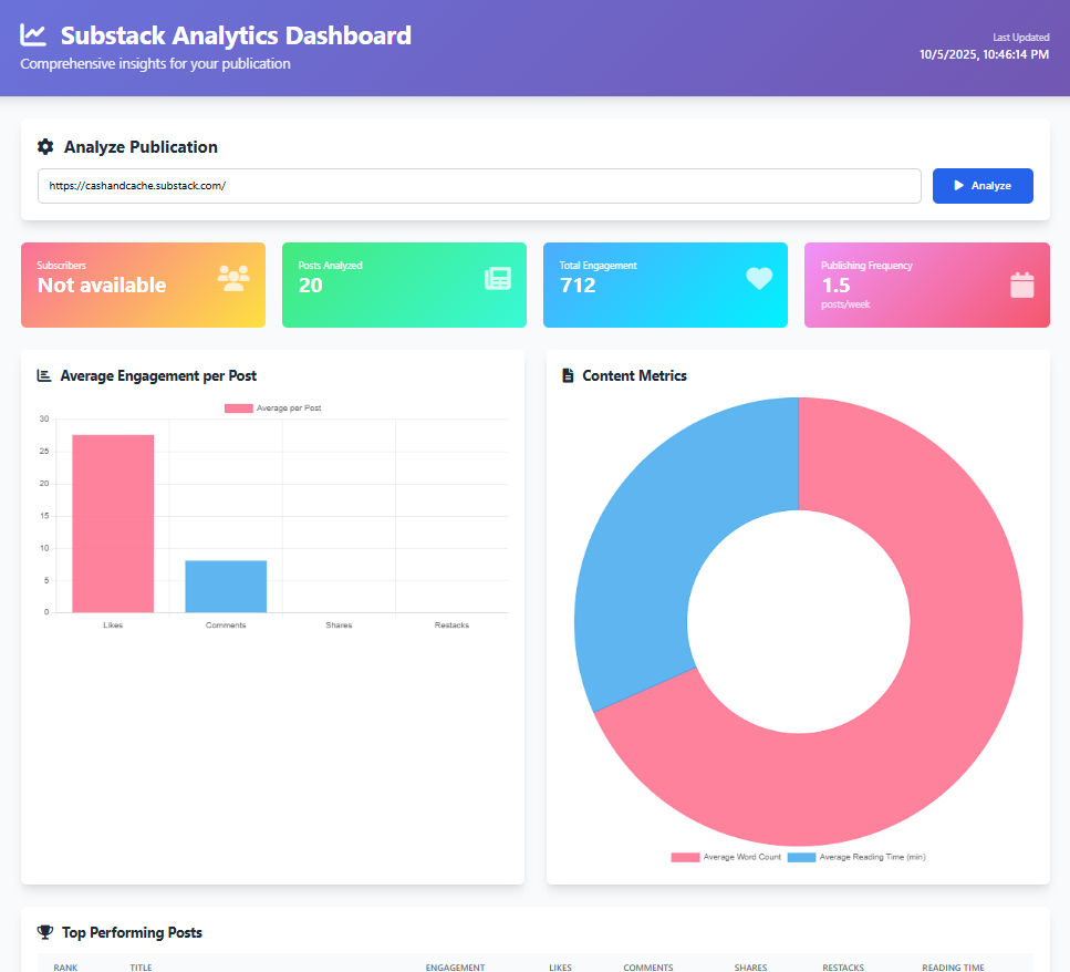
This is what the data dashboard looks like:
🧠 What I Learned and What’s Next
Start small and keep shipping. Tiny wins build momentum. This tool is still a WIP but it gives us a foundation to build on and incorporate user feedback
Expect chaos. The web is messy and context rot is reality. If you are not a programmer, creating a tool like this will take more than just few iterations
Accuracy beats quantity. Reliable data builds trust. Always query the platform to put a “-” or “N/A” instead of leaving it unattended for the code will make-up figures if it cannot extract the correct data.
Simplicity wins. Minimal design keeps the focus on insight. Before I add in more sophisticated functionalities in back-end and front-end, I want to test the tool with few Substack users.
I’m keeping the tool lean for now. I’ve been thinking past basic engagement and post stats in trying to figure out what would actually make this dashboard useful for creators. The goal’s to go from surface numbers to real insights. Stuff that shows how people interact with your work, not just what they read.
I received some initial feedback from our Substack community when I asked them directly about additional KPIs they would want to see in Substack’s dashboard:
Daily profile visits: see how many people check out your Substack profile, not just individual posts.
Per-link click tracking: find out which specific links inside your posts get the most clicks.
Button-level conversions: if you’ve got multiple subscribe buttons in a post, track which one actually drives signups.
Engagement leaderboard: spot your most active subscribers or followers over time.
Non-subscriber interactions: track when non-subscribers click or view posts, even if they don’t end up subscribing.
Word frequency analysis: see which words or themes pop up most across your posts.
These kinds of metrics could turn the dashboard into a full-on creator intelligence tool. One that doesn’t just show what performed, but why.
📢 We are also looking to connect with Substack writers individually to help us understand what metrics they wish to have in a Substack dashboard. If you want to talk and help us in this process, contact us or communicate your interest in the comments!
🎤 Wrapping Up
This started as a weekend experiment and turned into something I actually could use every day for my publication. Cursor didn’t think for me, rather it kept me moving by improving my thought process and helping me write clean scripts. It explained errors, simplified syntax, and gave me just enough help to stay productive.
The dashboard isn’t perfect yet. There are still quirks and minor data gaps, but it already shows me both the obvious metrics (likes, comments) and the hidden ones using Excel allows me to synthesize (posting frequency, engagement curves, top topics et al).
Although it remains a work in progress, this phase is particularly valuable as it allows me to test the tool with other users, gather concrete feedback on its performance and user needs, and refine the dashboard into a robust, potentially go-to product for evaluating newsletter performance.
💬 What are some of performance metrics or KPIs that you think is a MUST to evaluate your publications’ newsletter? Share your insights, and let’s continue the discussion.
💡 If you’ve been enjoying these builds as a subscriber, consider pledging to support Cash & Cache. It helps us keep experimenting and sharing our learnings.
🔎 If you found this read interesting, check out some similar articles:


🗞️ Interested in staying up to date with latest news around tech and business but not getting enough time?
The Weekly Cache has you covered! It’s our weekly news digest that rounds up all the important news stories in tech, markets, and, business in a crisp, sub 5-minute read. Check out last week’s news stories:


This is looking really good! You’re indeed building something genuinely useful. I can see a lot of people finding it helpful, especially since not everyone is technical or able to export results at the same level. A general UI that works for most users would be incredibly valuable. I’m looking forward to seeing your progress as you push it out and publish it!
Congratulations on this great start! 🎉 Seeing profile views would be great as well as attributing them to different posts and notes.